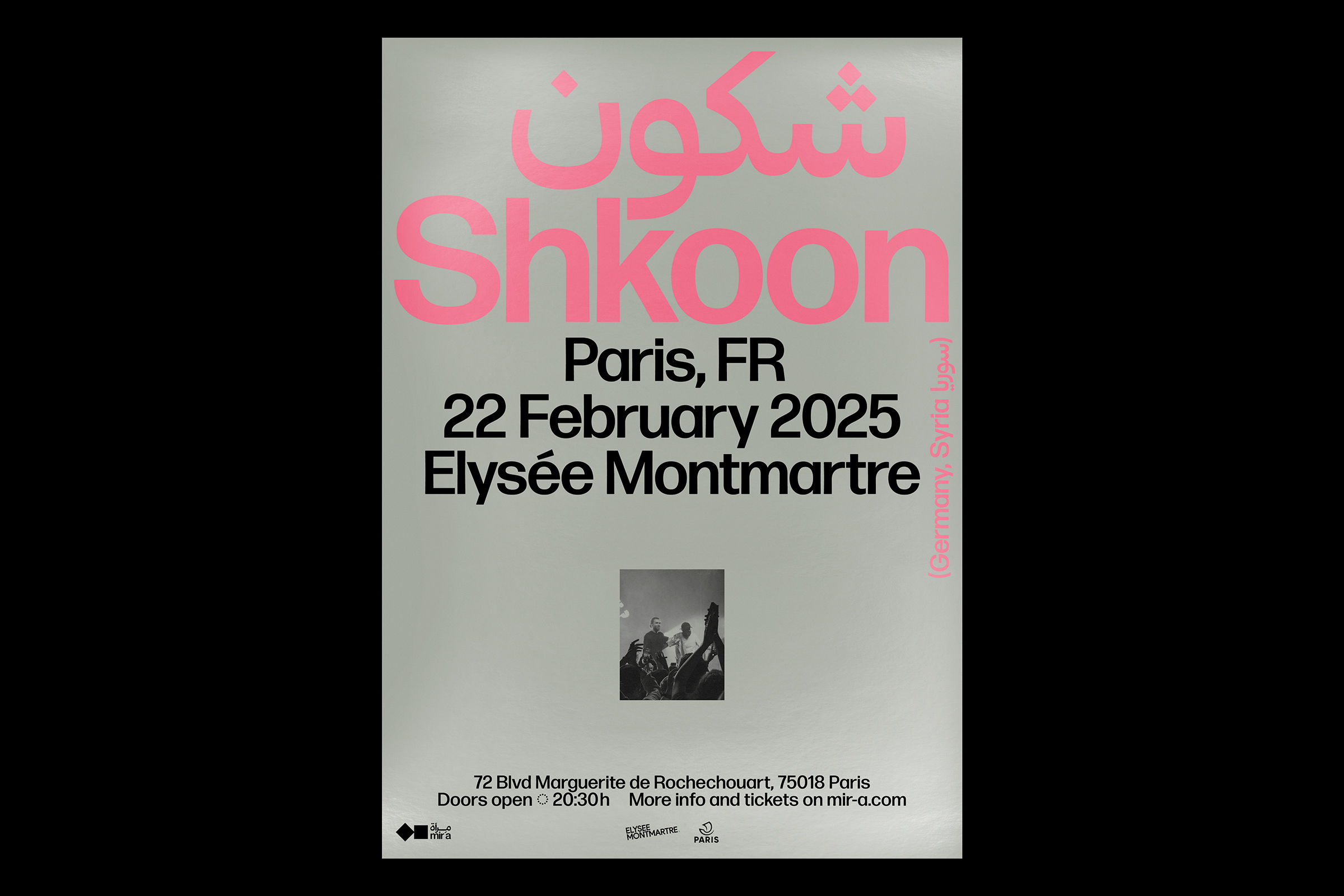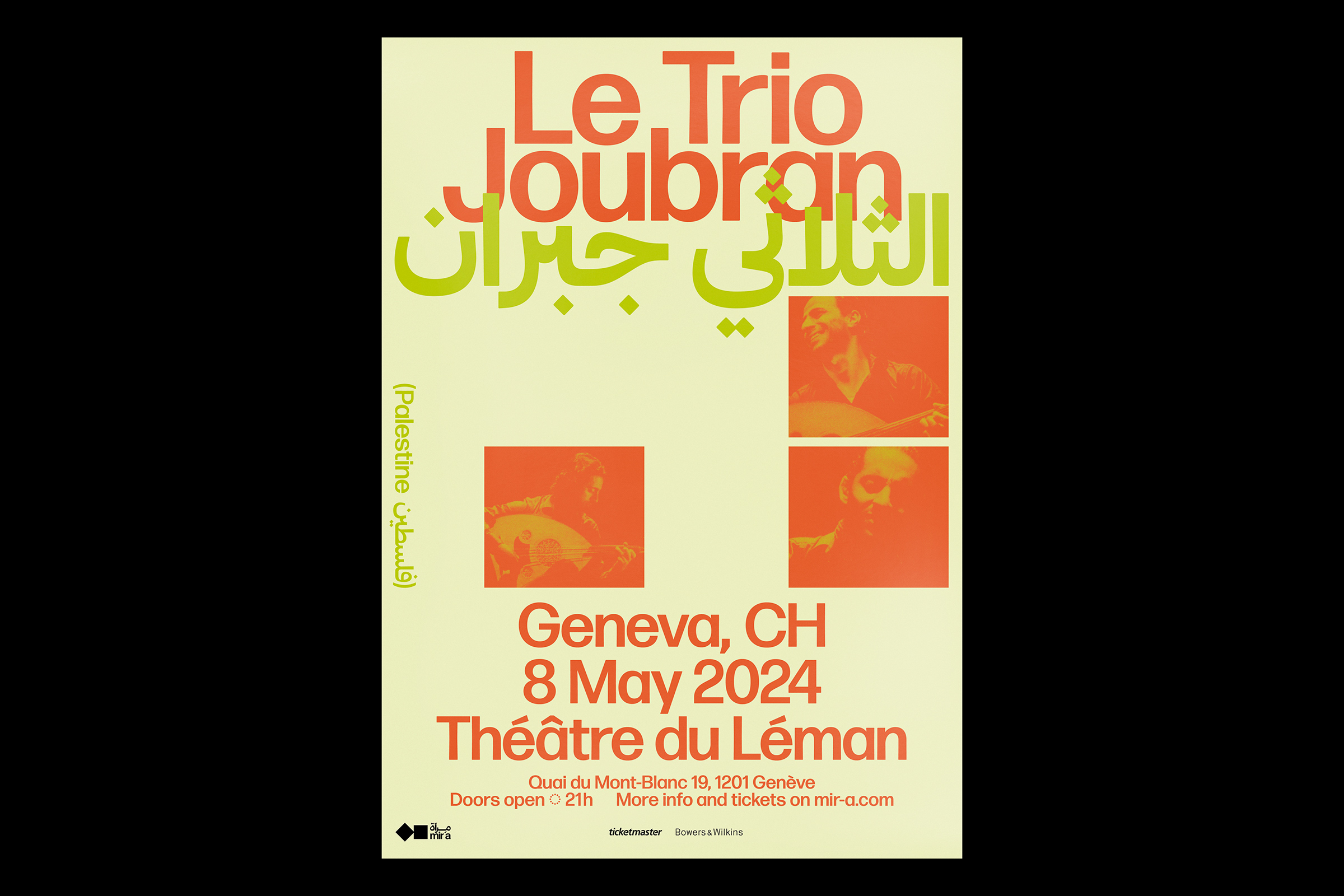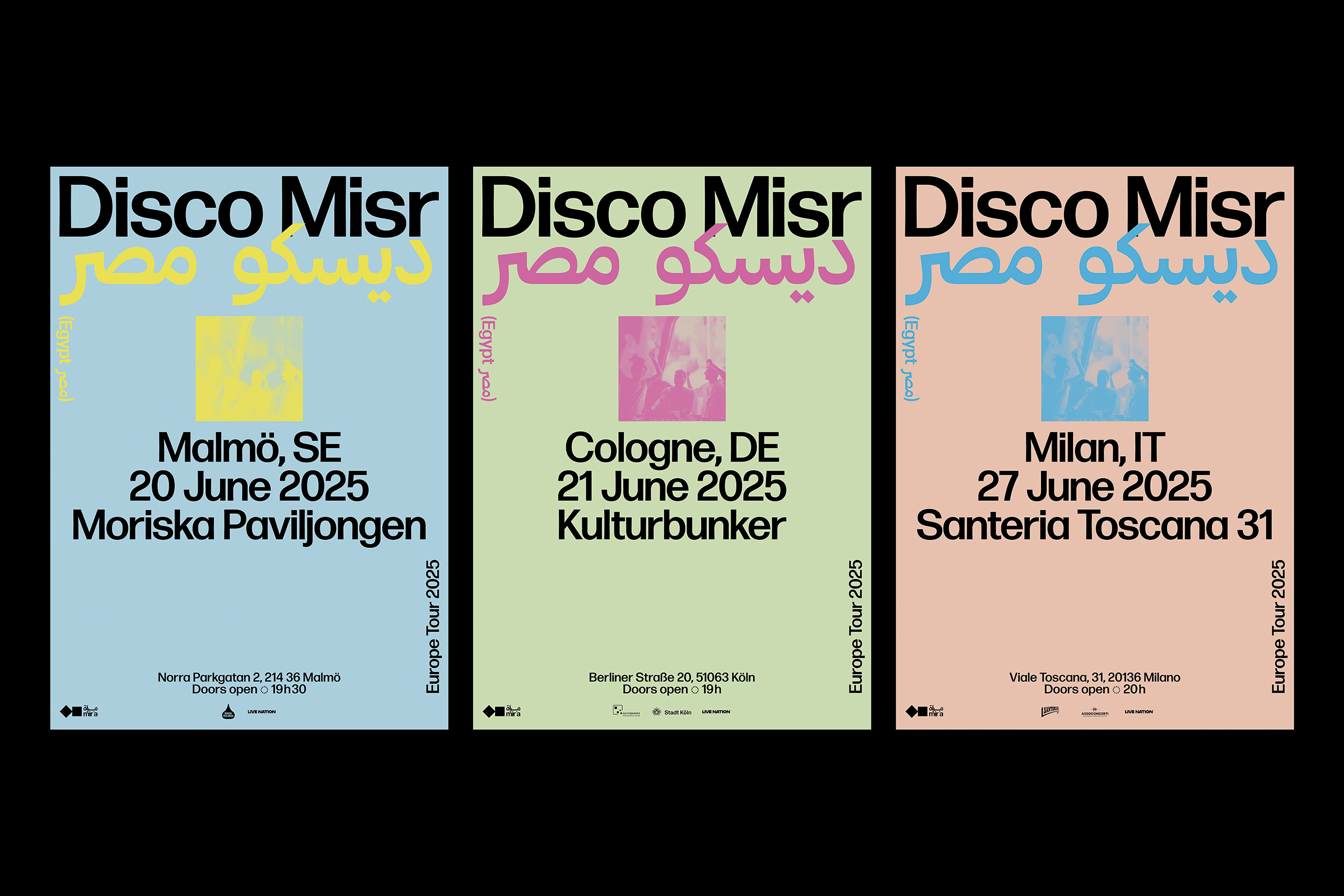


Mir’a creates cultural events to promote Middle Eastern and North African artists in some of Europe’s most prestigious venues. Through concerts, performances, screenings and exhibitions, Mir’a celebrates the rich diversity of the MENA region and sheds light on emerging and established talent to a large audience.
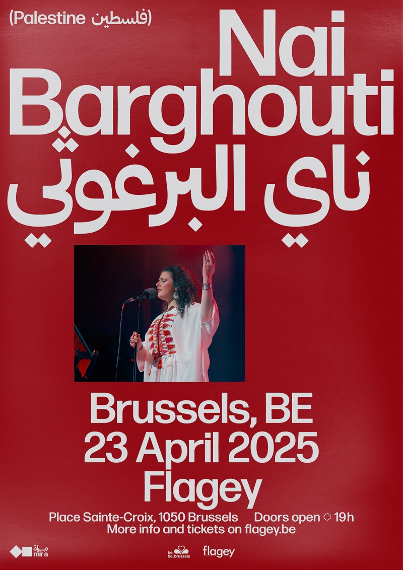
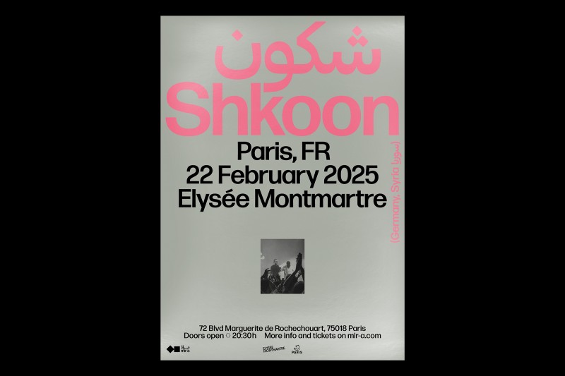
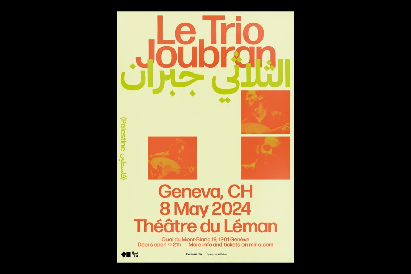
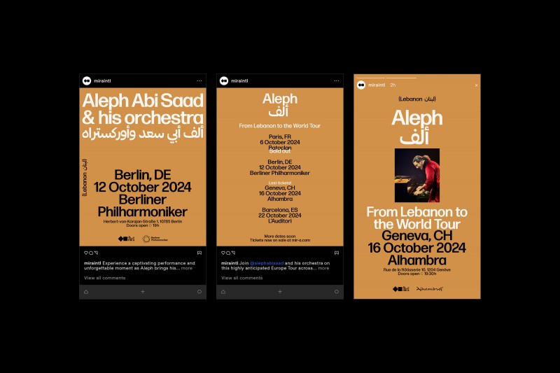
The visual identity reflects Mir’a’s unifying mission. The bilingual logo design plays on the relationship between the two wordmarks, with shared punctuation and harmonious stacking. The symbol evokes cultural synergy, emphasising the connection between Arabic and Latin writing to create a simple yet striking icon. The typography-driven communication uses both scripts assertively to present the artists and their native countries in a spirit of representation and integrity.
Campaign, Digital, Identity, Print, Typography
Culture